


Here are some examples of lettering I think is especially eye-catching.
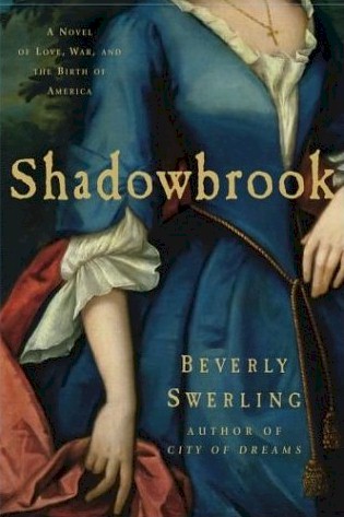
Beverly Swerling's Shadowbrook (set during the French and Indian War):
Mary Lee Settle's I, Roger Williams (17th c England and colonial Rhode Island). Plain cover, but I like how the font's used to capture the look of the protagonist's signature.
Sile Rice's The Saxon Tapestry (about Hereward the Wake). More illuminated lettering than a font per se, but isn't it gorgeous?
John Ensor Harr's Dark Eagle (novel about Benedict Arnold and the American Revolution). A distant cousin of mine, as it happens. Black sheep of the family? Note the semi-headless look, too, and this cover from 1999.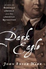
Diana Paxson's The Serpent's Tooth (historical fantasy going back to the Celtic origins of King Lear). Besides the fact that I'll likely buy anything that Thomas Canty illustrates... On the other hand, the lettering on Ann Lawrence's Do You Believe?, a paranormal romance/gothic, convinced me to pick it up. I'd guessed it was set during the Salem Witch trials, but it's not - it's contemporary. But it worked. I read and enjoyed it quite a bit.
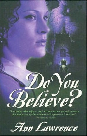
What are some of your favorite examples?
Nice ones (especially the first three) but I'm drawing a blank!
ReplyDeleteIt's not something that's usually noticed, but I've been trying to find historical-looking fonts for web design projects I'm doing, so they've been catching my eye lately!
ReplyDeleteSarah, have you tried this site? It's where we found the fonts we used for Ingeld's Daughter. It has quite a range of historical-looking fonts to choose from.
ReplyDeleteNice site!
ReplyDeleteThanks, Carla - there are some nice looking fonts there.
ReplyDeleteSarah:
ReplyDeleteYou've probably already looked here, but I use fontpool and search by category. Here is the section for "blackletter fonts".
Hi Susan - nice ones there too, thanks! I'm not that familiar with font libraries, but I found some attractive ones to download there.
ReplyDeleteHmmm, well, without most of my books to look at, I can't really say off the top of my head. Though most of SKP's books have great fonts on the cover!!
ReplyDelete